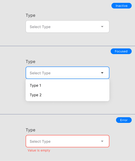
TextField Dropdown
The text field dropdown allows the user to select text.
TextFieldDropdown(
    onChanged: (String value) {},
    title: 'Type',
    hint: 'Select type',
    selectedItem: 'Type 2',
    items: const ['All type', 'Type 1', 'Type 2', 'Type 3'],
)
Constructors
onChangeduse this property to retrieve data.titledefines the title on top field.selectedIteminitial value selected.dropdownKeykey of the Widget.
Customization
To change the whole Field Dropdown Theme, please open the core/themes/app_theme.dart. Here's how to change the Widget TextField theme:
inputDecorationTheme: InputDecorationTheme(
  contentPadding: const EdgeInsets.all(AppDimens.paddingMedium),
  errorStyle: const TextStyle(color: AppColors.red),
  alignLabelWithHint: true,
  floatingLabelBehavior: FloatingLabelBehavior.never,
  hintStyle: TextStyle(color: AppColors.grey.shade300),
  border: OutlineInputBorder(
    borderSide: BorderSide(color: AppColors.grey.shade100, width: 1),
    borderRadius: BorderRadius.circular(AppDimens.radiusMedium),
  ),
  enabledBorder: OutlineInputBorder(
    borderSide: BorderSide(color: AppColors.grey.shade300, width: 1),
    borderRadius: BorderRadius.circular(AppDimens.radiusMedium),
  ),
  focusedBorder: OutlineInputBorder(
    borderSide: const BorderSide(color: AppColors.secondary, width: 1.5),
    borderRadius: BorderRadius.circular(AppDimens.radiusMedium),
  ),
  errorBorder: OutlineInputBorder(
    borderSide: const BorderSide(color: AppColors.red, width: 1.5),
    borderRadius: BorderRadius.circular(AppDimens.radiusMedium),
  ),
  focusedErrorBorder: OutlineInputBorder(
    borderSide: const BorderSide(color: AppColors.red, width: 1.5),
    borderRadius: BorderRadius.circular(AppDimens.radiusMedium),
  ),
)
Support Packages
Info
The Textfield Dropdown uses the dropdown_search package to call DropdownSearch. For more can be learned in Pub Dev.
Authors: