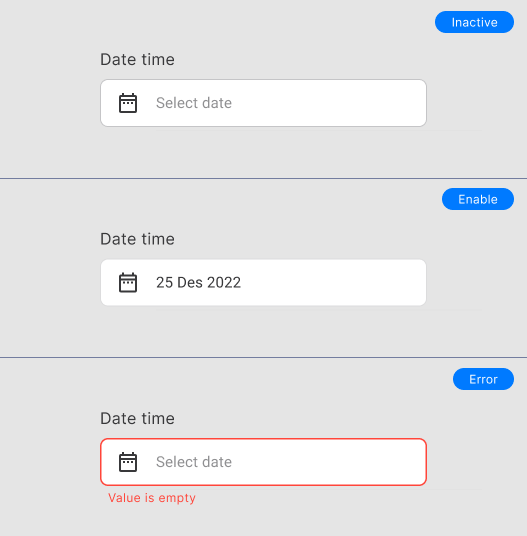
TextField Date Picker
The text field date allows the user to select date.
Danger
This component on development, if you use the component please follow this documentation.
Warning
The Text field return String formatter e.g 12 January 2022 and use the extention is yMMMMd. For convert to DateTime on controller please use:
Constructors
controlleruse this property to retrieve data.titledefines the title on top field.initialDatedefault isDateTime.now(), initial value selected.firstDatedefault isDateTime(1945), The [firstDate] is the earliest allowable date.lastDatedefault isDateTime.now(), The [lastDate] is the latest allowable date.
Customization
To change the whole Input Theme, please open the core/themes/app_theme.dart. Here's how to change the Widget TextField theme:
inputDecorationTheme: InputDecorationTheme(
  contentPadding: const EdgeInsets.all(AppDimens.paddingMedium),
  errorStyle: const TextStyle(color: AppColors.red),
  alignLabelWithHint: true,
  floatingLabelBehavior: FloatingLabelBehavior.never,
  hintStyle: TextStyle(color: AppColors.grey.shade300),
  border: OutlineInputBorder(
    borderSide: BorderSide(color: AppColors.grey.shade100, width: 1),
    borderRadius: BorderRadius.circular(AppDimens.radiusMedium),
  ),
  enabledBorder: OutlineInputBorder(
    borderSide: BorderSide(color: AppColors.grey.shade300, width: 1),
    borderRadius: BorderRadius.circular(AppDimens.radiusMedium),
  ),
  focusedBorder: OutlineInputBorder(
    borderSide: const BorderSide(color: AppColors.secondary, width: 1.5),
    borderRadius: BorderRadius.circular(AppDimens.radiusMedium),
  ),
  errorBorder: OutlineInputBorder(
    borderSide: const BorderSide(color: AppColors.red, width: 1.5),
    borderRadius: BorderRadius.circular(AppDimens.radiusMedium),
  ),
  focusedErrorBorder: OutlineInputBorder(
    borderSide: const BorderSide(color: AppColors.red, width: 1.5),
    borderRadius: BorderRadius.circular(AppDimens.radiusMedium),
  ),
)
Authors: